
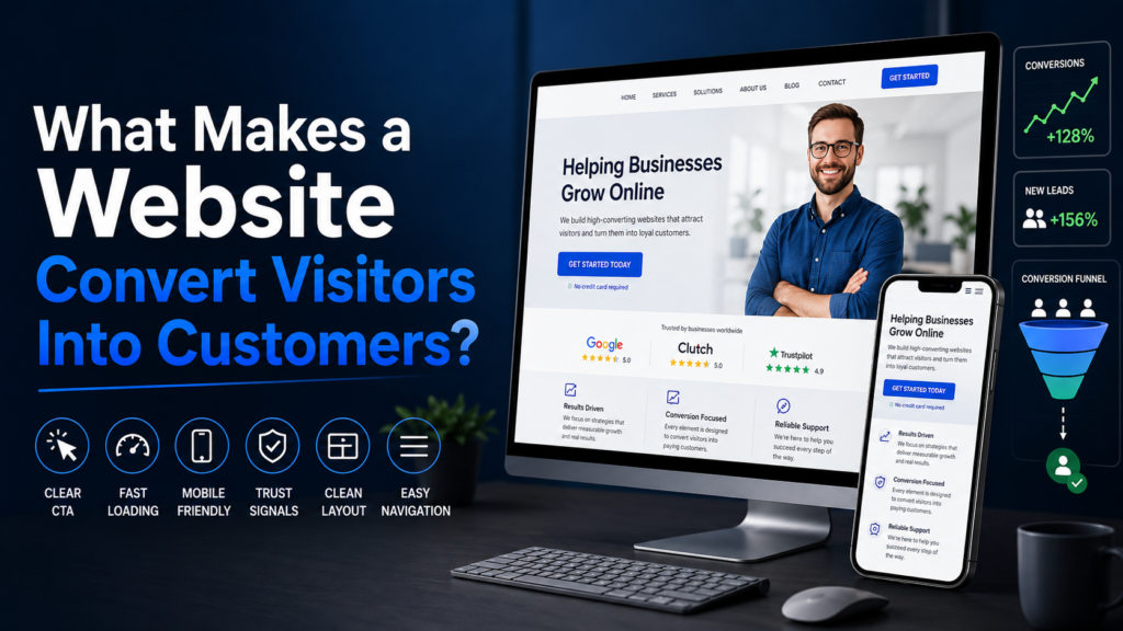
Turning Convert Visitors is the goal of every business website. A conversion-focused website doesn’t rely on luck — it’s built around a clear structure, persuasive messaging, and friction-free paths to action. At Blog AM Digitalz, we focus on sharing practical website growth tips that help businesses improve user experience, build trust, and generate more leads. In this article, you’ll learn the essential elements of a conversion-focused website and practical steps to apply them to your business, whether you run a local clinic, service company, or e-commerce brand.
1. A Clear, Benefit-Driven Headline
Your headline is the first thing visitors see. It must quickly communicate what you do and why it matters. A strong headline follows a simple formula: what + who + benefit.
- What: State the main service or product (“Affordable HVAC repair”).
- Who: Identify the audience when relevant (“for homeowners in Dallas”).
- Benefit: Explain the outcome (“fast same-day service, fixed right the first time”).
Example: “Emergency Plumbing Repairs for City Homes — Fast Response, No Surprises.” Short, specific, and focused on the customer benefit.
2. A Strong Offer Above the Fold
Visitors decide in seconds whether to stay. Place a clear offer — a free consultation, discount, or fast estimate — above the fold. The offer should be specific, time-framed if possible, and tied to the CTA.
Example offers:
- “Free 15-minute consultation — Book now”
- “Get 10% off your first service — Claim today”
- “Instant quote in 60 seconds”
3. Benefit-Driven Sections (Not Feature Lists)
People buy outcomes, not features. Structure your page into short sections that explain benefits, supported by a brief description of how you deliver those benefits.
Section structure example:
- Benefit headline: “Save time and avoid stress”
- Short explanation: 1–2 sentences explaining how you achieve this.
- Proof or example: A short client story or specific result.
For a dentist: “Pain-free cleanings — advanced sedation options for anxious patients.” Then add 1–2 lines about the experience and a small client testimonial.
4. Clear, Compelling CTA Buttons
Calls-to-action are conversion engines. Use action-driven language, make CTAs visually distinct, and repeat them logically down the page. Each CTA should match the user’s stage — “Learn more” for research, “Get a free quote” for ready-to-convert visitors.
CTA best practices:
- Use contrasting colors and a sufficient size for mobile taps.
- Write benefit-led copy: “Get My Free Quote” instead of “Submit”.
- Place CTAs near key content blocks and at the end of the page.
- Limit choices — one primary CTA per screen reduces decision friction.
5. Social Proof: Testimonials, Reviews, and Case Studies
Trust is a major conversion driver. Display customer testimonials, star reviews, and short case studies near CTAs to reassure prospects. Use real names and photos when possible; if not, include company names and service details.
Example placements:
- Right below the main CTA for immediate reassurance.
- On a dedicated “Results” or “Testimonials” section with 3–5 strong quotes.
- Case study callouts for service-based businesses that show a before-and-after or measurable outcome.
6. Trust Signals and Badges
Trust badges — security seals, certifications, and partner logos — help reduce anxiety. Include them near forms and payment sections. For local service providers, show associations, licensing numbers, and insurance details.
Example: A home services page could show “Licensed & Insured,” Better Business Bureau badge, and local chamber membership near the booking form.
7. Easy, Optimized Lead Forms
Forms are where conversions happen. Make forms short and purposeful. Ask only for essential information and use smart defaults or progress indicators for longer forms.
Form best practices:
- Ask fewer fields — name, phone, or email, and one qualifying question.
- Use inline validation and clear error messages.
- Show a confirmation message and next steps after submission.
- Offer alternative contact methods (click-to-call, chat) for mobile users.
8. Clear Service Pages and Offer Clarity
Each service or product should have its own clear page explaining benefits, process, and pricing or pricing cues. Avoid vague terms; instead, show what’s included and what to expect on first contact.
Example structure for a service page:
- Clear headline with the service name and primary benefit.
- Short summary of what the service includes.
- Step-by-step process (what happens after you book).
- Pricing ranges or “starting at” info to set expectations.
- CTA and trust signals.
9. Faster Mobile Speed and Responsive Design
Mobile users expect fast-loading pages. Mobile speed affects both user experience and conversions. Prioritize responsive design, optimized images, and simplified mobile layouts so visitors can act quickly.
Quick mobile optimizations:
- Compress images and use modern formats.
- Minimize third-party scripts that block rendering.
- Use large tap targets for CTAs.
- Test forms on mobile before launch.
10. Anticipate Objections with an FAQ Section
Address common concerns in a short FAQ near the bottom of the page. Answer questions about guarantees, pricing, timelines, and refunds. This reduces friction and saves time for your sales team.
Example FAQ items for a local contractor:
- “How quickly can you start the job?”
- “Do you provide written estimates?”
- “What warranty do you offer?”
Putting It Together: A Simple Conversion-Focused Website Structure
- Header with clear contact option and primary CTA.
- Main hero with headline, supporting subheadline, and primary offer/CTA.
- Benefit-driven sections with short proofs or examples.
- Social proof and trust badges near CTA points.
- Service detail blocks or product highlights.
- Lead form and secondary CTAs tailored by intent.
- FAQ and final CTA in the footer or at the page end.
This flow guides visitors from awareness to action with minimal friction.
Practical Examples
Small examples show how this works in practice:
- Local Florist: Hero: “Same-day wedding bouquets in San Diego — curated by local florists.” Offer: “Free consultation for orders over $200.” CTA: “Book your consultation.” Testimonials and photos of arrangements follow.
- Dental Clinic: Hero: “Gentle family dentistry with evening hours.” Offer: “New patient special: exam + x-rays for $99.” CTA: “Schedule Now.” Include patient testimonials and insurance info nearby.
- HVAC Service: Hero: “24/7 emergency HVAC repair.” Offer: “$49 diagnostic fee waived for first-time customers.” CTA: “Request Same-Day Service.” Show licenses, BBB badge, and a quick form for contact.
Measure and Iterate (CRO Basics)
Building a conversion-focused website is ongoing. Use simple metrics to track performance: visits, bounce rate, CTA clicks, form submissions, and conversion rate. Run small tests — different headlines, CTA text, or form lengths — and measure impact.
Start with one change at a time, run it for enough traffic, and compare results. Incremental improvements compound over time.
Common Mistakes to Avoid
- Too many CTAs that confuse visitors.
- Long, dense paragraphs instead of scannable sections.
- Hidden pricing or unclear offers that increase friction.
- Neglecting mobile usability and page speed.
Conclusion
A conversion-focused website combines clear messaging, smart offers, trust signals, and low-friction paths to action. By structuring pages around benefits, placing strategic CTAs, and simplifying forms and mobile experience, small businesses and service providers can significantly improve lead generation and sales.
If you’re ready to increase conversions, AM Digitalz helps businesses design conversion-focused websites and optimize landing pages for measurable results. Contact AM Digitalz to review your site and get a prioritized plan to improve conversions and grow leads.